MAGAZINE
The Art of Wood Harmony: Mastering Multiple Species and Tones in Luxury Interiors
A comprehensive guide to combining different wood species and tones to create sophisticated, cohesive spaces that honor traditional Indian craftsmanship while embracing contemporary design
Published: December 2025 | Reading Time: ~12 minutes | Category: Interior Design & Craftsmanship
In the realm of luxury interior design, few challenges prove as nuanced—and as rewarding—as the artful combination of different wood species and tones within a single space. While amateur approaches often result in visual chaos or monotonous uniformity, masterful wood mixing creates depth, warmth, and sophisticated visual dialogue that elevates residential interiors from beautiful to extraordinary.
At Crosby, our 30+ artisan workshop in Tamil Nadu has spent decades perfecting the science and art of wood combination. Drawing upon centuries-old Indian craftsmanship traditions while incorporating contemporary design principles, we’ve developed a comprehensive methodology for creating harmonious multi-wood interiors that resonate with both aesthetic sophistication and environmental responsibility.
This guide distills our accumulated knowledge into practical principles that homeowners, designers, and design enthusiasts can apply to their own projects—whether working with our artisans or undertaking independent design endeavors.
Understanding Wood: The Foundation of Successful Combination
Before exploring combination strategies, one must understand wood itself—its character, behavior, and inherent qualities that determine compatibility with other species.
The Anatomy of Wood Character
Every wood species possesses a unique personality defined by multiple characteristics:
Grain Pattern and Direction
Grain refers to the arrangement of wood fibers, visible as patterns on the surface:
- Straight grain: Fibers run parallel to the wood’s length (teak, mahogany)
- Interlocked grain: Fibers spiral around the trunk (sapele, African mahogany)
- Wavy grain: Undulating patterns creating visual movement (fiddleback maple, curly koa)
- Irregular grain: Unpredictable patterns from burls or crotch wood (walnut burl, mango)
Understanding grain direction proves crucial because:
- Woods with similar grain patterns create cohesion even when tones differ
- Contrasting grain patterns can create intentional visual tension
- Grain direction affects how wood reflects light, influencing perceived tone
Color Spectrum and Undertones
Wood color encompasses both base tone and subtle undertones:
- Warm woods: Yellow, orange, or red undertones (teak, cherry, mango, sheesham)
- Cool woods: Gray, green, or blue undertones (ash, certain oak varieties, maple)
- Neutral woods: Balanced undertones that work with both warm and cool palettes (walnut, certain rosewood varieties)
In our Tamil Nadu workshop, we maintain extensive samples demonstrating how the same wood species can vary dramatically in tone depending on:
- Tree age and growing conditions
- Specific cut location within the tree
- Seasoning and treatment methods
- Finishing techniques applied
Density and Visual Weight
Wood density affects not just structural properties but visual perception:
- Dense, heavy woods (rosewood, ebony, sissoo): Create visual “weight,” grounding a space
- Medium-density woods (teak, walnut, mango): Versatile, working in both grounding and lighter applications
- Lighter woods (pine, certain bamboos, poplar): Create airiness and visual lift
Successful multi-wood interiors often balance visual weight, using denser woods for grounding elements (flooring, large case goods) and lighter woods for elevated elements (ceiling treatments, upper cabinetry).
Texture and Surface Quality
Wood texture ranges from fine to coarse:
- Fine-textured woods (maple, cherry, certain mahoganies): Smooth, refined appearance
- Medium-textured woods (walnut, teak, oak): Visible but not dominant pores
- Coarse-textured woods (ash, oak varieties, chestnut): Prominent, textural surface
Texture combinations create tactile and visual interest. Our artisans often pair:
- Fine-textured woods for primary surfaces requiring refined touch (tabletops, drawer fronts)
- Coarse-textured woods for structural or accent elements where texture adds character
Indian Wood Species: A Rich Palette
India’s forests offer exceptional diversity of wood species, each with distinctive characteristics:
Teak (Tectona grandis)
- Color: Golden to medium brown with darker streaks
- Grain: Straight to slightly interlocked, medium texture
- Characteristics: Exceptional durability, natural oils resist moisture
- Traditional uses: Furniture, doors, flooring throughout South India
- Sustainability note: Requires FSC certification; we source from certified Tamil Nadu plantations
Sheesham/Rosewood (Dalbergia sissoo)
- Color: Rich brown to deep chocolate with darker graining
- Grain: Distinctive, often highly figured
- Characteristics: Dense, durable, develops beautiful patina
- Traditional uses: Statement furniture, architectural elements
- Sustainability note: Increasingly restricted; we use certified plantation-grown or reclaimed sources
Mango Wood (Mangifera indica)
- Color: Light brown to golden with varied figuring
- Grain: Often spalted or figured, creating unique patterns
- Characteristics: Sustainable (from fruit tree harvest), distinctive character
- Traditional uses: Contemporary furniture, decorative pieces
- Sustainability note: Highly sustainable, utilizing trees at end of fruit-producing life
Neem (Azadirachta indica)
- Color: Light reddish-brown to pale golden
- Grain: Straight to interlocked, medium-fine texture
- Characteristics: Natural pest-resistant properties, moderate durability
- Traditional uses: Traditional furniture, architectural millwork
- Sustainability note: Fast-growing, readily available from sustainable sources
Jackfruit Wood (Artocarpus heterophyllus)
- Color: Yellow-brown to golden-orange
- Grain: Interlocked, often with distinctive figure
- Characteristics: Termite-resistant, develops rich patina
- Traditional uses: Kerala traditional architecture, contemporary furniture
- Sustainability note: Reclaimed from fruit trees, highly sustainable
Sal (Shorea robusta)
- Color: Light to dark brown, sometimes with reddish tinge
- Grain: Interlocked, medium to coarse texture
- Characteristics: Extremely durable, suitable for structural applications
- Traditional uses: Flooring, structural beams, exterior applications
- Sustainability note: Requires careful sourcing from certified forests
Understanding these species’ individual characteristics allows our Tamil Nadu artisans to make informed pairing decisions, creating combinations that honor each wood’s unique qualities while achieving overall design harmony.
The Crosby Methodology: Seven Principles for Harmonious Wood Combination
Through decades of creating bespoke interiors across India and internationally, we’ve codified seven core principles that guide successful multi-wood design:
Principle 1: Establish a Dominant Wood Species
Every successful multi-wood interior establishes clear hierarchy. One wood species should dominate, typically comprising 60-70% of visible wood surfaces. This dominant wood:
- Sets the overall tone and temperature (warm/cool) of the space
- Provides visual continuity across the interior
- Creates a foundation against which accent woods create interest
Application in Practice: The Bangalore Contemporary Villa
For a recent project in Bangalore’s Embassy Golf Links, we designed an open-plan living space featuring five different wood species. We established teak as the dominant wood, using it for:
- Flooring throughout the 3,000 sq ft main level
- Primary cabinetry in the kitchen
- Structural ceiling beams
- Window and door frames
This teak foundation (comprising approximately 65% of visible wood) provided warm, golden continuity. Against this base, we introduced:
- Walnut for dining table and credenza (dark, rich contrast)
- Mango wood for decorative shelving (lighter, figured accent)
- Ebony inlay details in custom furniture (punctuation marks of deep color)
- Bamboo for ceiling panels in specific zones (textural variation, lighter tone)
The result: a space reading as cohesive yet dynamic, where each wood species plays a clear role in the overall composition.
Principle 2: Respect Undertone Compatibility
Wood undertones—the subtle color casts beneath the surface—determine whether species will harmonize or clash. The most common error in multi-wood interiors stems from mixing incompatible undertones.
Warm Undertone Woods (yellow, orange, red casts):
- Teak: Golden-yellow undertones
- Mango: Warm golden-brown
- Cherry: Reddish-brown
- Certain mahoganies: Reddish undertones
Cool Undertone Woods (gray, green, blue casts):
- Ash: Gray undertones
- Certain oaks: Greenish casts
- Maple (unstained): Cool, neutral
- Weathered or limed woods: Gray casts
Neutral Undertone Woods (balanced, versatile):
- Walnut: Balanced brown with subtle purple cast
- Certain rosewood varieties: Neutral brown-black
- Reclaimed teak (aged): Loses yellow cast, becomes more neutral
The Undertone Rule:
Woods sharing undertone families harmonize naturally, even when differing dramatically in value (light to dark). Conversely, mixing warm and cool undertones requires:
- Intentionality: The contrast must be deliberate and significant enough to read as design decision rather than mistake
- Neutral bridging: Using neutral-toned woods to mediate between warm and cool
- Spatial separation: Placing warm and cool woods in different zones or functions
- Minimal mixing: Limiting to two undertone families maximum in a single space
Case Study: The Noida Penthouse
A client requested mixing teak (warm golden) and ash (cool gray). Rather than combining them directly, we created zones:
Warm Zone (living, dining):
- Teak flooring
- Mango wood shelving
- Warm brass accents
Cool Zone (home office, library):
- Ash cabinetry
- Gray-stained oak desk
- Steel accents
Transition Zone (hallway):
- Walnut (neutral undertone) furniture
- Stone flooring (neutral)
- Mixed metal accents
This zoning honored both wood preferences while maintaining coherence in each individual space.
Principle 3: Create Intentional Contrast in Value
Value—the relative lightness or darkness of wood—provides crucial visual hierarchy and interest. Successful multi-wood interiors typically incorporate woods spanning the value spectrum:
Light Values (pale, airy):
- Unfinished maple
- Light ash
- Bleached or limed woods
- Pale mango wood
Medium Values (most versatile):
- Natural teak
- Walnut
- Cherry
- Medium-tone oak
Dark Values (grounding, dramatic):
- Dark walnut
- Rosewood
- Ebony
- Darkened or fumed oak
The Value Distribution Strategy:
For visually balanced spaces, we typically recommend:
- 60-70% medium value (dominant wood)
- 20-30% either lighter OR darker (supporting contrast)
- 5-10% opposite contrast (accent notes)
Application: The Mumbai Transitional Residence
For a Worli apartment, we created a sophisticated value progression:
Medium base (65%):
- Natural teak flooring
- Teak window frames and doors
Light accent (25%):
- Pale mango wood for ceiling coffers
- Light ash for kitchen upper cabinets
- Bleached wood for custom light fixtures
Dark punctuation (10%):
- Dark walnut dining table
- Rosewood console in entry
- Ebony inlay in custom millwork
The progression created visual movement, with the eye traveling from grounded dark pieces, through the dominant medium-tone foundation, to elevated light elements—a vertical value gradient that enhanced the space’s 11-foot ceiling heights.
Principle 4: Balance Grain Patterns for Visual Rhythm
Grain pattern—the visual texture created by wood fiber arrangement—significantly impacts how multiple woods interact. Successful combination requires balancing:
Quiet Grains (subtle, refined):
- Straight-grained teak
- Rift-cut oak
- Plain-sawn maple
- Bamboo
Active Grains (figured, dynamic):
- Burled woods
- Highly figured walnut
- Spalted mango
- Fiddleback or quilted species
The Grain Balance Principle:
Like musical composition, successful interiors balance “notes” of varying intensity:
- Too many active grains create visual chaos, fighting for attention
- Too many quiet grains risk monotony, lacking visual interest
- Optimal balance: Quiet grains for majority surfaces, active grains for focal points
Grain Pattern Strategy by Application:
Our Tamil Nadu workshop follows these guidelines:
Flooring: Moderate to quiet grain
- Covers large surface area
- Should provide foundation, not dominate
- Exception: When flooring IS the primary design statement
Cabinetry/Millwork: Quiet to moderate grain
- Large surface areas require restraint
- Allows decorative objects displayed to take focus
- Grain becomes subtle texture rather than pattern
Furniture/Statement Pieces: Moderate to active grain
- Smaller surface areas support visual intensity
- Grain contributes to piece’s individual character
- Creates focal points within larger wood context
Decorative Elements/Inlay: Active grain welcomed
- Small scale allows intensity
- Creates jewelry-like detail moments
- Rewards close inspection
Case Example: The Delhi Bungalow Reading Room
For a book-lined study, we balanced grain intensity:
Quiet grain foundation:
- Straight-grain teak flooring (1,200 sq ft)
- Rift-cut oak for built-in bookshelves (covering three walls)
- Subtle-grain teak for window frames
Moderate grain furniture:
- Walnut desk with attractive but not overwhelming grain
- Teak occasional tables with medium figure
Active grain accents:
- Burled walnut humidor on desk (18″ x 12″ surface)
- Spalted mango wood bookends
- Highly figured rosewood for library ladder rails
The distribution—approximately 85% quiet/moderate, 15% active—allowed the room’s 6,000+ books to provide visual interest while wood contributed warmth without competition.
Principle 5: Consider Wood in Context with Other Materials
Wood never exists in isolation. Successful combination requires considering interaction with:
Stone and Tile
Stone brings:
- Cool tones (most marbles, granites, slates)
- Smooth or textured surfaces
- Permanence and weight
Strategic pairing:
- Warm woods (teak, mango) offset cool marble
- Rough stone textures contrast smooth wood finishes
- Vertical wood elements lighten horizontal stone masses
Recent project example: In a Gurgaon residence, we combined:
- Cool Makrana marble flooring (white with subtle gray veining)
- Warm teak cabinetry and millwork
- Medium walnut furniture
- The warm woods balanced the marble’s coolness, creating year-round comfort in a climate with extreme seasonal temperature variation
Metals and Hardware
Metal finishes interact powerfully with wood tones:
Warm metals (brass, bronze, copper, gold):
- Harmonize naturally with warm-toned woods (teak, mango, cherry)
- Can create intentional contrast with cool woods
- Traditional in Indian design vocabulary
Cool metals (steel, chrome, nickel, pewter):
- Complement cool-toned woods (ash, certain oaks)
- Provide modern contrast with warm traditional woods
- Contemporary design preference
Mixed metals:
- Increasingly popular in transitional design
- Requires careful calibration
- We typically limit to two metal finishes per space, selecting based on dominant wood undertone
Textiles and Upholstery
Fabric color and texture profoundly affect wood perception:
- Light, neutral fabrics make dark woods appear richer
- Saturated fabric colors can overwhelm subtle wood tones
- Textile patterns compete with active wood grain
Our approach: In spaces featuring multiple wood species and tones, we recommend:
- Solid or subtly patterned upholstery
- Colors drawn from wood undertones (terra cottas, warm grays, soft greens with warm woods)
- Texture (weave, nap) rather than pattern for visual interest
Principle 6: Account for Natural and Artificial Lighting
Light transforms wood appearance dramatically. Species that harmonize beautifully in one lighting condition may clash in another.
Natural Light Considerations
Direction and quality:
- North-facing rooms (India context—cooler, more consistent light):
- Warm woods appear more muted
- May require warmer artificial lighting supplement
- Cool-toned woods can appear cold, lifeless
- South-facing rooms (warmer, more intense light):
- Warm woods glow, sometimes appearing overly orange
- Cool woods benefit from warm light balance
- Direct sun requires UV protection for wood surfaces
- East/West facing (dramatic daily variation):
- Morning light (east): Cool, often flattering to most woods
- Afternoon/evening light (west): Warm, intensifies warm-toned woods
- Requires consideration of room’s primary use time
Seasonal considerations (particularly relevant in North India):
- Monsoon season: Diffused, gray light
- Warm woods maintain warmth
- Cool woods appear especially cool
- Generally benefits warm-toned interiors
- Winter season: Lower angle, golden light
- Intensifies warm wood tones
- Generally flattering to most wood combinations
- Can make already warm spaces feel overly yellow
Artificial Lighting Strategy
Color temperature selection:
- Warm white (2700K-3000K):
- Enhances warm-toned woods
- Can make cool woods appear slightly warmer
- Traditional choice for residential spaces
- Our default recommendation for multi-wood interiors
- Neutral white (3500K-4100K):
- Shows wood tones most accurately
- Useful in spaces where color accuracy matters (home offices, art collections)
- Can feel sterile if not balanced with warmer accent lighting
- Cool white (5000K+):
- We rarely recommend for residential interiors
- Can make warm woods appear yellowed, sickly
- Appropriate only for specific task lighting applications
Lighting placement for multi-wood spaces:
Our lighting design for multi-wood interiors typically includes:
Ambient lighting (overall illumination):
- Warm white (2700K-3000K)
- Even distribution avoiding harsh shadows that distort wood tone perception
Accent lighting (highlighting specific wood elements):
- Focused on statement pieces in accent woods
- Slightly warmer (2700K) to enhance wood richness
- Often utilizing traditional brass fixtures that harmonize with warm woods
Task lighting (functional illumination):
- Neutral white (3500K) for accuracy where needed
- Primarily in kitchens, home offices, detailed work areas
- Balanced with warm ambient lighting to avoid coolness
Case Study: The Chandigarh Modern Farmhouse
This project particularly challenged lighting design. The open-plan living space featured:
- Teak flooring (warm, golden)
- Walnut furniture (medium-neutral tone)
- Limed oak ceiling beams (cool, gray-white)
- White-washed brick walls (neutral but slightly cool)
Our lighting solution:
Layer 1—Ambient (recessed LED, 2700K):
- General illumination warming the cool ceiling and walls
- Made the walnut furniture glow
- Prevented teak from appearing overly yellow
Layer 2—Accent (track-mounted spots, 2700K):
- Highlighting walnut furniture pieces
- Grazing limed oak beams to emphasize texture
- Creating visual hierarchy in the wood elements
Layer 3—Task (pendant fixtures, 3000K):
- Kitchen island
- Dining table
- Reading areas
- Slightly cooler than ambient but still warm enough to harmonize
Layer 4—Decorative (traditional brass fixtures, 2700K):
- Table lamps with warm Edison-style bulbs
- Floor lamps with fabric shades
- Adding human scale and traditional warmth
The multi-layer approach allowed each wood species to appear its best while maintaining overall harmony—the teak stayed warm but not orange, the walnut remained rich, and the limed oak provided intended cool contrast without appearing stark.
Principle 7: Plan for Aging and Patina Development
All wood changes over time. Successful multi-wood interiors account for how species will age, ensuring harmony today endures for decades.
Common Aging Patterns
Darkening woods:
- Cherry: Lightest when fresh, darkens significantly to reddish-brown over 3-5 years
- Teak: Develops richer, deeper golden-brown with age and exposure
- Certain mahoganies: Deepen to rich red-browns
Lightening woods:
- Walnut: Can lighten slightly, purple cast becomes more pronounced
- Rosewood: Sometimes lightens in high-UV exposure areas
- Bamboo: Often lightens, developing silvery tones
Color-stable woods:
- Maple: Relatively stable, develops slight amber tones
- Certain oaks: Minimal color change with proper finishing
- Engineered/stabilized woods: Designed for color stability
Strategic Planning for Aging
When combining woods with different aging patterns, we consider:
Initial selection accounting for future state:
- If combining cherry (will darken) with walnut (relatively stable), we select initial cherry shade that will harmonize with walnut after darkening
- Sometimes select slightly lighter initial tone knowing it will deepen
Finish selection influencing aging:
- Oil finishes: Allow maximum color development, woods age most naturally
- UV-protective finishes: Slow aging, maintaining initial color longer
- Opaque stains: Prevent natural aging, maintain artificial color
Spatial planning:
- Woods prone to UV darkening/lightening placed away from strong sun exposure
- Or embracing uneven aging as design feature (ombre effects, intentional variation)
Maintenance protocols:
- Regular refinishing schedules maintaining harmony
- Periodic tone adjustment to keep multiple species aligned
- Documentation of original tones for restoration reference
Long-term Project Example: The Delhi Heritage Restoration
For a 1940s bungalow renovation completed in 2010, we combined:
- Original sal wood structural beams (70+ years old, stable dark brown)
- New teak flooring (warm golden-brown)
- New walnut furniture (medium chocolate brown)
15-year aging considerations:
At installation (2010):
- New teak appeared quite yellow compared to aged sal
- Walnut provided intermediate tone
- Overall contrast felt significant
Current state (2025):
- Teak has deepened substantially, now warm honey-gold
- More harmonious with the sal beams
- Walnut has lightened slightly, maintaining its bridging role
- System has matured into even greater harmony
We anticipated this evolution, explaining to clients that the initial contrast would mellow. Regular documentation photos show the beautiful aging progression, validating our original planning.
Room-by-Room Application: Strategic Wood Combination
Different rooms present unique opportunities and challenges for multi-wood design:
Living Rooms and Reception Spaces
Design considerations:
- Often the most visible rooms, setting design tone for entire home
- Typically large surface areas requiring careful balance
- Mix of flooring, millwork, and furniture creates natural wood variety
Crosby Project approach:
Dominant wood (flooring + major millwork):
- Selection based on desired overall warmth/coolness
- Typically medium-toned for versatility
- Example: Teak flooring in warm-oriented homes, white oak for cooler aesthetics
Secondary wood (built-in cabinetry, media units):
- Often same as dominant but with different finish
- Or complementary species in similar tone
- Example: Teak flooring with darker stained teak cabinetry, or walnut cabinetry providing contrast
Accent woods (furniture, decorative elements):
- Opportunity for drama—lighter or darker contrast
- Where figured or exotic woods appropriate
- Example: Burled walnut console, mango wood accent tables against teak foundation
Recent project: Gurgaon Contemporary Residence
3,500 sq ft open-plan living/dining:
- Base: Natural teak flooring (65% of visible wood)
- Secondary: Darker-stained teak built-ins and TV wall (20%)
- Accent furniture: Walnut dining table, walnut credenza (10%)
- Decorative: Spalted mango floating shelves, ebony inlay details (5%)
Result: Warm, cohesive yet dynamic—all woods sharing warm undertones, with value contrast creating visual interest.
Kitchens
Design considerations:
- High moisture, temperature variation environment
- Large cabinet surface areas dominating visual field
- Functional requirements limiting wood placement
Crosby Project approach:
Primary cabinetry:
- Typically single wood species for continuity
- Medium-value, moderate grain preferred
- Common selections: Teak, oak, walnut (depending on overall design direction)
Contrasting island or accent cabinetry:
- Opportunity for second wood species
- Often darker or lighter than main cabinetry
- Example: White oak perimeter cabinets with walnut island
Open shelving:
- Chance to introduce third wood
- Often lighter than cabinetry
- Example: Mango or ash shelving against darker cabinetry
Flooring:
- Should complement but not match cabinetry
- Different species preferred to avoid monotony
- Example: Teak cabinetry with sal or oak flooring
Hardware and accents:
- Metal tones coordinated with wood undertones
- Brass with warm woods, steel/nickel with cool woods
Case study: Noida Modular Kitchen (2,200 sq ft)
Main cabinetry (perimeter, uppers and lowers):
- Teak with matte natural finish
- Straight grain selected for refined appearance
Kitchen island:
- Darker walnut base cabinetry
- Provides dramatic anchor in center of large space
- White marble countertop bridges color gap
Open shelving (range wall):
- Light mango wood with visible figuring
- Creates visual lightness against heavy cabinetry
- Displays colorful dishware and accessories
Flooring:
- Large-format tile (not wood due to moisture)
- Warm gray tone bridging teak and walnut
- Wood-look porcelain considered but rejected to avoid competing wood patterns
Hardware:
- Brushed brass throughout
- Harmonizes with warm teak and walnut undertones
- Leather cabinet pulls on island adding organic texture
The kitchen successfully integrated three wood species without feeling busy, each playing a clear functional and aesthetic role.
Bedrooms
Design considerations:
- Personal, intimate spaces allowing more individual expression
- Typically smaller than public rooms, supporting richer wood combinations
- Lighting often warmer, flattering to woods
Crosby Project approach:
Flooring:
- Often continues from hallway/public areas for flow
- Or distinct, setting bedroom apart as sanctuary
- Frequently warmer, softer woods (teak, walnut) for comfort association
Built-in wardrobes/storage:
- Opportunity for second wood species
- Often lighter than flooring for airiness
- Or darker for sophisticated, cocooning effect
Furniture (bed, nightstands, dresser):
- Third wood species possible in bedrooms
- Statement pieces in accent woods
- Example: Rosewood bed against teak flooring and lighter oak wardrobes
Ceiling treatments:
- Increasingly popular in luxury bedrooms
- Often lightest wood in room
- Creates sense of height and airiness
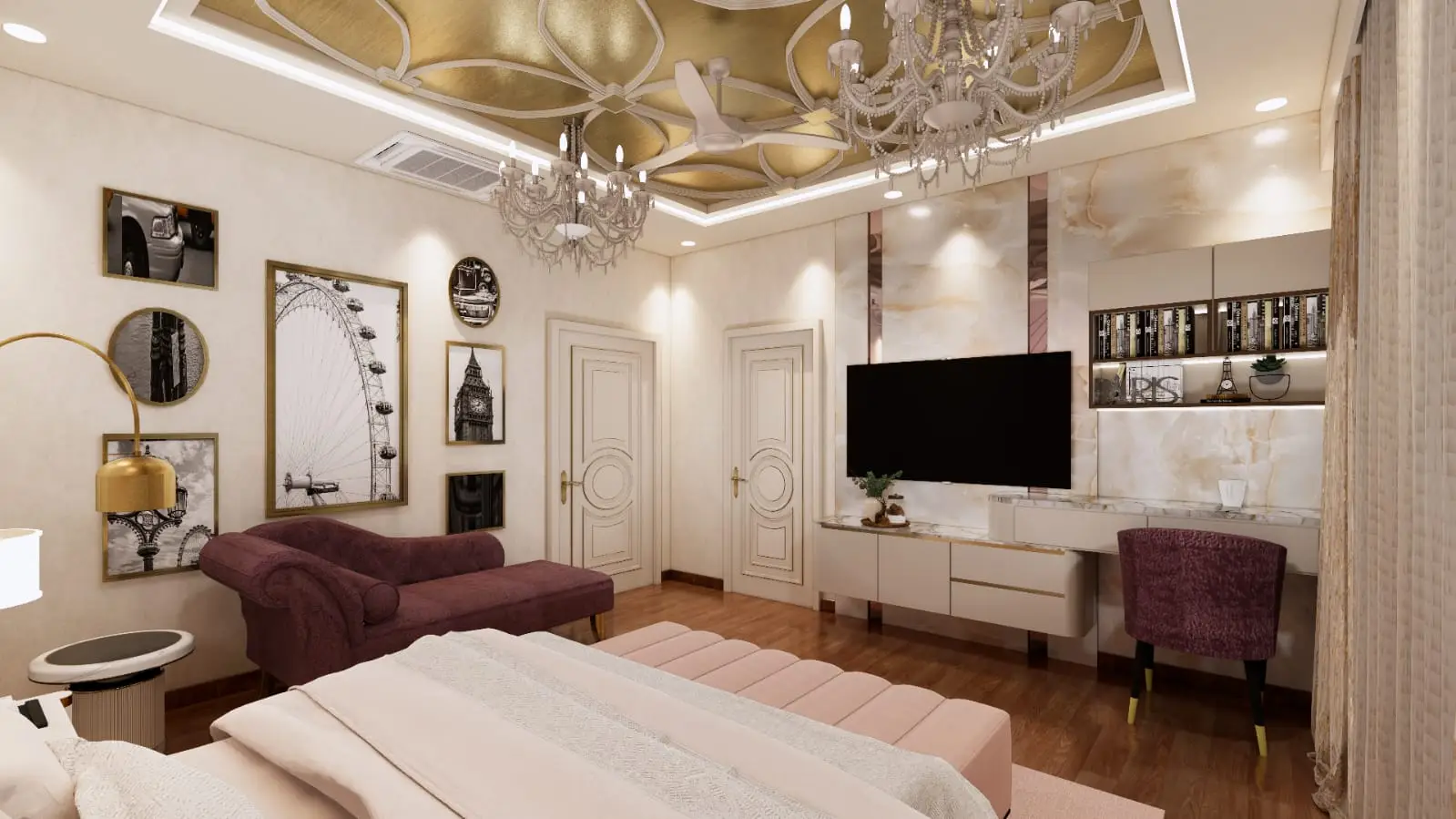
Project example: Bangalore Master Bedroom Suite (800 sq ft)
Flooring:
- Wide-plank teak
- Warm, inviting, continuous with hallway
Built-in wardrobes (12 linear feet):
- Limed oak
- Cool, fresh contrast to warm floor
- Makes wardrobes recede visually, appearing architectural rather than furniture
Bed and nightstands:
- Dark walnut
- Rich, luxurious, grounding
- Provides dramatic focal point
Ceiling feature (coffered detail over bed):
- Pale mango wood
- Lightest element, drawing eye up
- Creating volume in 10-foot ceiling
Result: Four wood species successfully integrated:
- Warm teak foundation
- Cool oak architectural element
- Rich walnut furniture focus
- Light mango overhead accent
- Distributed across different planes (floor, walls, furniture, ceiling) preventing competition
Home Offices and Libraries
Design considerations:
- Often wood-intensive (built-in shelving, paneling, furniture)
- Require careful calibration to avoid overwhelming richness
- Balance tradition (wood libraries) with contemporary function
Crosby Project approach:
Built-in shelving:
- Typically dominant wood due to surface area
- Often single species for continuity
- Medium to quiet grain preventing distraction
Desk and task furniture:
- Opportunity for contrasting species
- Often darker, richer than shelving
- Example: Walnut desk against oak shelving
Flooring:
- Should support but not compete
- Often continues from adjacent spaces
- Can be different from shelving for contrast
Architectural millwork (paneling, coffered ceilings):
- Same as or complementary to shelving
- Lighter tones expanding small office spaces
- Darker tones in larger libraries creating intimacy
Signature project: Delhi Advocate’s Library (1,800 sq ft)
This project for a senior advocate required extensive book storage (12,000+ volumes) while maintaining professional elegance:
Built-in bookshelves (covering three walls, floor to 12-foot ceiling):
- Quarter-sawn white oak
- Quiet grain preventing visual competition with books
- Medium-light tone maintaining brightness despite tall shelves
Custom desk (12 feet x 4 feet):
- Solid walnut top
- Rich, dark, commanding presence
- Anchors the room as professional center
Library ladder and rails:
- Dark teak with brass hardware
- Traditional functionality with refined execution
- Darker than shelving, providing visual punctuation
Flooring:
- Herringbone teak parquet
- Pattern and warm tone contrasting cool oak shelving
- Traditional detailing appropriate to room’s formal function
Ceiling coffers:
- Pale ash
- Lightest element preventing ceiling from pressing down
- Modern detail in otherwise traditional room
Five wood species, each with clear justification:
- Oak shelving—dominant, neutral, unobtrusive
- Walnut desk—focal point, professional gravitas
- Teak flooring—warmth, pattern, tradition
- Teak ladder—functional accent, traditional detail
- Ash ceiling—contemporary lightness
The density of wood in the space required exceptional discipline in species selection and tone distribution. The result reads as intentionally layered rather than chaotic.
Common Mistakes in Multi-Wood Design (And How to Avoid Them)
Through decades of correcting poorly executed multi-wood interiors, we’ve identified recurring errors:
Mistake 1: Matching Wood Tones Too Exactly
The error: Attempting to match different wood species to identical tone, resulting in near-match that reads as failed attempt rather than intentional variety.
Why it fails: Different species age differently, so matched tones diverge over time. Near-matches appear as mistakes rather than contrasts.
The Crosby solution: Embrace clear distinction. If using multiple species, make the difference obvious—different enough to read as intentional. Either match species exactly or create clear contrast.
Example: Instead of matching teak flooring with cherry furniture (both warm but subtly different), use teak flooring with dark walnut furniture (clear contrast) or teak flooring with teak furniture (exact match).
Mistake 2: Too Many Species in Small Spaces
The error: Incorporating 4-5 different wood species in a small room (under 300 sq ft), creating visual chaos.
Why it fails: Limited surface area prevents any single wood from establishing dominance. Eye finds no rest point.
The Crosby solution: In smaller spaces (under 400 sq ft), limit to 2-3 wood species maximum:
- One dominant (60-70% of visible wood)
- One contrast (25-35%)
- Possibly one small accent (5-10%)
Example: In a 250 sq ft guest bedroom:
- Teak flooring (dominant)
- Walnut bed frame (contrast)
- Small mango wood accessories (accent)
- NOT: Teak floor + walnut bed + oak nightstands + cherry dresser + bamboo ceiling
Mistake 3: Ignoring Existing Architectural Wood
The error: Selecting furniture and cabinetry woods without considering existing architectural elements (door frames, window frames, ceiling beams).
Why it fails: Architectural wood is typically permanent, establishing a foundation that new elements must respect.
The Crosby solution: Always begin multi-wood planning by cataloging existing architectural wood:
- What species? What tone? What finish?
- How much surface area?
- Can it be refinished/modified, or is it permanent? Then select new woods that harmonize with this existing foundation.
Example: In a heritage home with original teak door and window frames throughout, we based entire wood palette on this:
- Matched teak species for new built-in cabinetry
- Selected walnut (complementary warm undertone) for furniture
- Avoided cool-toned woods (ash, certain oaks) that would clash with pervasive teak warmth
Mistake 4: Mixing Undertones Unintentionally
The error: Combining warm and cool-toned woods without strategic intention, resulting in visual dissonance.
Why it fails: Undertone incompatibility reads as mistake rather than design decision. Creates subtle “wrongness” difficult to articulate but universally felt.
The Crosby solution:
- Identify undertones of every wood being considered
- Choose: Either stay within one undertone family OR intentionally contrast with clear separation
- Never: Mix undertones accidentally in the same functional grouping (all flooring, all cabinetry)
Example of successful intentional contrast:
- Living room: Warm teak flooring, warm mango furniture, brass accents
- Adjacent home office: Cool ash desk, steel accents, gray stone floor
- Clear division at doorway, intentional temperature shift supporting functional change
Example of unsuccessful accidental mixing:
- Teak flooring (warm yellow undertone)
- Gray-stained oak cabinets (cool gray undertone)
- Cherry furniture (warm red undertone)
- Result: Visual confusion, no clear intent
Mistake 5: Ignoring How Wood Interacts with Non-Wood Materials
The error: Selecting wood combinations that work in isolation but clash with stone, tile, metal, or textile elements in the actual space.
Why it fails: Wood never exists alone. Its appearance changes dramatically based on surrounding materials.
The Crosby solution: Create material boards showing all elements together:
- Wood samples (minimum 6″ x 6″ to show grain patterns)
- Stone/tile samples
- Metal finishes (hardware, fixtures, accents)
- Textile swatches (upholstery, window treatments)
- Paint colors
View these together in the actual space under real lighting conditions before committing.
Case example: For a Mumbai apartment, client selected:
- Warm teak flooring
- Warm walnut furniture
- Cool Carrara marble for bathrooms
Individually beautiful, but when samples viewed together, the cool marble clashed with pervasive wood warmth.
Our solution: Changed to warmer marble (Jaisalmer yellow) with cream/gold veining. Maintained luxury and light while harmonizing with wood undertones.
Mistake 6: Forgetting About Natural Light Variation
The error: Selecting woods under showroom or warehouse lighting without considering actual home lighting conditions.
Why it fails: Wood appearance changes dramatically based on light direction, intensity, and color temperature.
The Crosby solution:
- Always review wood samples in the actual space
- View at different times of day (morning, afternoon, evening)
- Test under both natural and artificial light
- Consider seasonal variation (particularly in North India with dramatic seasonal light changes)
Example: Samples appearing beautifully harmonious under warm showroom lighting can look completely different in a north-facing room with cool natural light. Always test in situ.
Sustainable Wood Sourcing: The Crosby Commitment
At Crosby Project, our 50+ artisan workshop in Tamil Nadu operates under stringent sustainability protocols. Our multi-wood designs only succeed ethically when every species comes from responsible sources.
Our Sourcing Standards
Primary criteria for all wood procurement:
1. Certification requirement:
- FSC (Forest Stewardship Council) certification preferred
- For species without available FSC certification, third-party verification of sustainable practices
- Documentation of chain of custody from forest to workshop
2. Reclaimed and salvaged priority:
- Actively source reclaimed timber from heritage structures, old furniture, demolished buildings
- Partner with salvage companies across Tamil Nadu, Kerala, Karnataka
- Preference for reclaimed when equivalent quality available, even at premium cost
3. Plantation-grown over wild-harvest:
- For teak, rosewood, and other controlled species, exclusively use plantation-grown
- Support sustainable plantation development in Tamil Nadu
- Long-term contracts with certified plantations ensuring supply security
4. End-of-life agricultural timber:
- Mango wood from trees at end of fruit-producing life
- Jackfruit wood similarly sourced
- Support to farmers for responsible timber harvest when replanting
5. Local sourcing preference:
- South Indian species prioritized
- Reduces transportation carbon footprint
- Supports regional economy
- Allows direct verification of sourcing practices
Transparency in Multi-Wood Projects
Every multi-wood interior we create includes complete material documentation:
For each wood species used:
- Species scientific and common name
- Origin (specific region, plantation, or salvage source)
- Certification documentation
- Volume used in project
- Estimated carbon sequestration (standing timber stored carbon)
- Carbon footprint of harvest, processing, transport
This transparency allows clients to:
- Understand environmental impact of their choices
- Make informed decisions between species options
- Document sustainability for LEED or similar green building certifications
- Communicate values to guests and visitors
Example documentation (from recent Bangalore project):
Teak flooring (1,800 sq ft):
- Species: Tectona grandis
- Source: Hosakote Teak Plantation, Karnataka (FSC certified)
- Volume: 2.4 cubic meters
- Carbon stored: Approximately 1,920 kg CO2
- Transport: 45 km from plantation to workshop
- Processing: Hand-milled in our Tamil Nadu workshop using traditional methods
Walnut furniture (dining table, credenza, console):
- Species: Juglans regia (English walnut)
- Source: Reclaimed from demolished 1960s government building, Bangalore
- Volume: 0.8 cubic meters
- Carbon impact: Negative (salvage prevented landfill methane, preserved stored carbon)
- Transport: 30 km from salvage yard to workshop
- Processing: Hand-milled, preserving maximum usable material
Mango wood shelving:
- Species: Mangifera indica
- Source: End-of-life orchard trees, Tamil Nadu
- Volume: 0.3 cubic meters
- Carbon impact: Near-neutral (agricultural harvest, would decompose naturally)
- Transport: 15 km from farm to workshop
- Processing: Minimal waste through skilled hand-cutting
This detailed documentation transforms wood selection from aesthetic decision to values statement.
The Future of Multi-Wood Interior Design
As we look toward the coming decades, several trends are shaping how luxury interiors approach wood combination:
Trend 1: Hyper-Local Species Exploration
Growing interest in showcasing regional wood species rather than defaulting to international exotics. This trend:
- Reduces transportation carbon footprint
- Supports local forestry and salvage operations
- Creates distinctive regional design vocabularies
- Often provides cost advantages
Crosby Project response: We’re developing comprehensive documentation of Tamil Nadu wood species, including:
- Lesser-known species with exceptional properties
- Traditional uses in Tamil architecture and furniture
- Contemporary applications in luxury interiors
- Sustainable availability assessment
Trend 2: Radical Transparency
Increasing client demand for complete supply chain transparency:
- Forest-to-furniture documentation
- Third-party verification of sustainability claims
- Carbon footprint calculations
- Fair labor practice documentation
Crosby Project response: Our blockchain-based tracking system (launched 2024) allows clients to:
- Track individual timber pieces from forest to finished furniture
- Verify all sustainability certifications
- Access photographs of source forests/salvage sites
- Understand full environmental and social impact
Trend 3: Circular Economy Design
Growing recognition that luxury furniture should be:
- Designed for eventual disassembly and material reuse
- Created with traditional joinery (not adhesives) allowing repair and restoration
- Documented sufficiently for future artisans to maintain
- Constructed to last generations, not decades
Crosby Project response: Every piece we create now includes:
- Detailed assembly documentation for future disassembly
- Traditional joinery throughout (mortise-tenon, dovetail, etc.)
- Modular design elements allowing component replacement
- Material composition documentation enabling eventual recycling
Trend 4: Technology-Enhanced Craftsmanship
Integration of technology to enhance rather than replace hand craftsmanship:
- 3D scanning for perfect fit of complex components
- Digital material databases allowing precise species selection
- Computer-aided design for complex joinery while maintaining hand execution
- Documentation photography and video at museum-archive standards
Crosby Project approach: Our Tamil Nadu workshop combines:
- Traditional hand tool techniques for primary fabrication
- Precision digital measurement for complex fitting
- Photogrammetry documentation of every project stage
- Digital collaboration tools allowing clients to participate remotely in creation process
Conclusion: The Art and Science of Wood Harmony
Successfully combining multiple wood species and tones in luxury interiors represents one of design’s most nuanced challenges. It requires:
Artistic sensibility:
- Understanding visual harmony and contrast
- Appreciating each wood species’ individual character
- Creating cohesive yet dynamic compositions
Scientific knowledge:
- Wood anatomy, behavior, and aging patterns
- Light interaction and color theory
- Material compatibility and structural requirements
Cultural awareness:
- Traditional design vocabularies and techniques
- Regional craft practices and their contemporary relevance
- The meaning and symbolism different woods carry
Environmental responsibility:
- Sustainable sourcing practices
- Carbon impact consideration
- Support for artisan communities and traditional knowledge preservation
At Crosby Project, our five decades of collective experience across our Tamil Nadu workshop, combined with our commitment to sustainable luxury, positions us uniquely to create multi-wood interiors that honor all these dimensions.
Whether you’re planning a new residence, renovating a heritage property, or seeking to upgrade specific rooms with custom furniture, understanding the principles of harmonious wood combination elevates results from merely expensive to genuinely exceptional.
The wood itself—harvested responsibly, crafted expertly, combined thoughtfully—tells a story. Stories of forests and artisans, of cultural traditions and contemporary innovation, of environmental stewardship and enduring beauty.
This is the promise of multi-wood luxury interiors. This is the philosophy and practice of Crosby Project.
For Consultations on Multi-Wood Interior Design:
Tamil Nadu Workshop & Showroom 355/357, Bhavani Main Road, Sunnambu Odai, B.P.Agraharam, Erode, Tamil Nadu 638005, India
International Office – Ireland Office 16 Leopardstown Abbey, Carrikmines, Dublin 18 D18YW10, Ireland
Contact: +91-8826860000 | +91-8056755133 | care@crosby.co.in