MAGAZINE
The Sophisticated Palette: Understanding Gray in Luxury Interior Design
How the world’s most discerning homeowners are using gray’s infinite variations to create spaces that transcend trends and speak to timeless elegance
Published: December 2025 | Reading Time: ~12 minutes | Category: Interior Design Philosophy
There’s a moment that occurs in nearly every consultation at our Tamil Nadu workshop when a client pauses, touches a gray fabric sample, and says something like, “I never knew gray could feel this warm.” It happens so regularly that we’ve come to expect it—this revelation that what most people dismiss as a neutral background color contains multitudes.
Gray has become the unexpected hero of contemporary luxury design, though not for the reasons you might think. Walk through any international design magazine and you’ll see it everywhere, but the gray appearing in truly exceptional homes bears little resemblance to the flat, lifeless tones that dominated corporate offices of the 1990s. What we’re witnessing instead is a renaissance—a rediscovery of gray’s extraordinary range and its unique ability to create spaces that feel simultaneously modern and timeless, sophisticated yet comfortable, designed yet effortless.
At Crosby Project, we’ve spent the better part of two decades exploring this seemingly simple color, working with master artisans in our Tamil Nadu facility who understand that achieving the perfect gray in wood finishing requires the same precision as a concert pianist finding exactly the right key. What we’ve learned could fill volumes, but it begins with a fundamental truth: there is no such thing as gray. There are only grays, plural, infinite, endlessly variable.
The Architecture of Gray: Why This Color Defies Simple Understanding
Consider for a moment what happens when you mix black and white paint. You get gray, certainly, but you also get something far more interesting—a color that has no hue of its own, that exists purely as a mediator between light and dark. This absence of inherent color makes gray uniquely responsive to its environment. It becomes a chameleon, picking up and reflecting the subtle color notes from everything around it.
Stand in a room painted what the color card calls “neutral gray” and watch what happens as the day progresses. Morning light from the east might give it lavender undertones. Afternoon sun could pull out surprising warmth, hints of taupe or greige. Evening brings coolness, sometimes even a blue-green quality that wasn’t visible at noon. The gray itself hasn’t changed, but everything about how we perceive it has transformed.
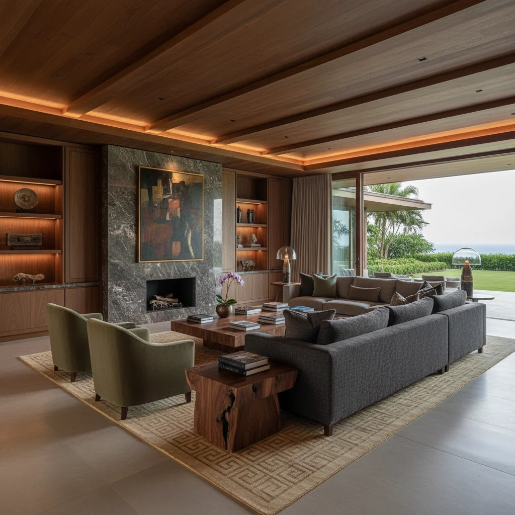
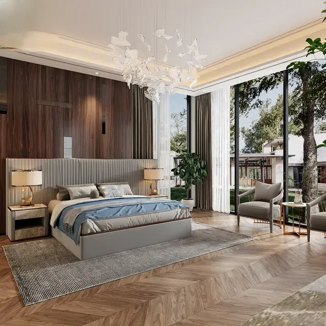
This quality of responsiveness is precisely what makes gray so powerful in luxury interiors, and precisely what makes it so challenging to work with successfully. We recently completed a residence in Bangalore where the clients wanted a serene, gallery-like quality for their extensive art collection. We used seventeen different grays throughout the 4,500 square foot space—seventeen variations that, to the untrained eye, might appear almost identical, but which create subtle shifts in mood and atmosphere as you move from room to room.
The living room gray carries whispers of warm brown, creating an embracing quality perfect for intimate conversations. Move into the hallway and the gray cools slightly, becoming more formal, preparing you for the transition to other spaces. The study features a gray with purple undertones that appears almost silver in afternoon light, creating perfect neutrality for focusing on work. Each gray was selected not just for its inherent quality but for how it would perform under the specific lighting conditions of its space, at the specific times of day the room would be most used.
The Temperature Paradox: When Cool Colors Create Warmth
One of the most persistent misconceptions about gray is that it’s inherently cold. You’ll hear this constantly—”I want a warm home, so I can’t use gray.” But temperature in color is far more nuanced than simple warm-versus-cool categorization. The gray in a cashmere sweater feels warm despite being technically cool-toned. The gray of weathered driftwood carries warmth despite lacking any obvious warm color component. How is this possible?
The answer lies in understanding that perceived warmth comes from multiple sources, not just color temperature. Texture creates warmth—the grain of wood, the weave of fabric, the tactile quality of materials. Light creates warmth—even the coolest gray becomes inviting when properly illuminated. Context creates warmth—a cool gray surrounded by warm materials absorbs and reflects that warmth.
We discovered this working on a project in Noida where the client insisted on cool grays throughout but was concerned about creating an austere, unwelcoming environment. The solution wasn’t to warm up the grays but to create warmth through every other design element. We specified teak flooring with its inherent golden warmth. We used brass hardware that glows against gray cabinetry. We incorporated textiles—raw silk, linen, wool—that added tactile warmth. We designed lighting that emphasized warm color temperatures.
The result? A home that feels deeply warm and inviting despite being executed almost entirely in shades that, on a color wheel, would be classified as cool. The grays became a sophisticated backdrop that allowed the warmth of natural materials and thoughtful lighting to shine. Visitors consistently describe the space as warm, never registering that they’re surrounded by what would technically be classified as cool colors.
This points to a larger truth about working with gray in luxury interiors: the color itself matters less than how you use it. Gray’s neutrality becomes its greatest strength, allowing you to create warmth or coolness, formality or casualness, through the materials, textures, and lighting you pair with it.
The Art of Layering: Creating Depth Through Tonal Variation
Perhaps the most critical skill in working with gray is understanding how to layer multiple tones to create visual richness. A room executed in a single shade of gray, no matter how beautiful that shade, will almost always feel flat and lifeless. But introduce subtle variations—lighter grays, darker grays, warm grays, cool grays—and suddenly depth emerges.
Think of it like a charcoal drawing, where the artist creates the illusion of three-dimensional form through nothing but variations in gray tone. The same principle applies to interior spaces. The interplay of different grays creates visual texture and interest, guiding the eye through a space and creating focal points without relying on color contrast.
In our Tamil Nadu workshop, we maintain sample boards showing gray wood finishes in progressively darker tones—what we call our “gradient studies.” These boards demonstrate how moving from a pale, almost-white gray on ceiling beams through medium grays in wall paneling to a deep charcoal gray in flooring creates a natural visual weight that feels grounding and serene. The transition is so gradual that you don’t consciously notice the shift, but you feel its effect in how comfortable and balanced the space feels.
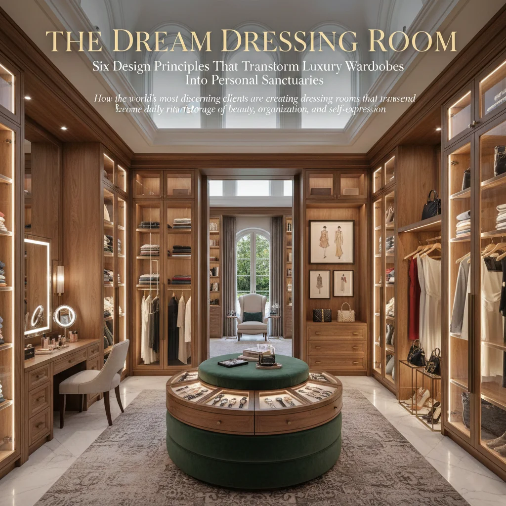
A recent project for a Delhi client illustrated this principle beautifully. They wanted a dressing room that felt like a luxurious, calm retreat. We created a tonal journey starting with the palest gray-white ceiling that reflected light and created a sense of height. The walls received a medium gray-beige in a subtle textured finish that added dimension without pattern. Built-in cabinetry came slightly darker, in a gray with taupe undertones that felt substantial and permanent. The island in the center of the room was executed in a rich, deep gray that anchored the space. The floor? A gray-brown engineered wood that provided warmth and connection to the earth.
Five different grays, none more than a few shades apart, creating a space that feels cohesive yet dynamic, simple yet sophisticated. The client later told us that she spends more time in her dressing room than anywhere else in the house—it has become her sanctuary, her place of calm in a chaotic world. The subtle orchestration of gray tones creates an environment that feels restful without being boring, refined without being cold.
Gray and Wood: A Romance Written in Grain and Tone
At Crosby Project, our deepest expertise lies in wood, and it’s in the marriage of gray with wood tones that we’ve found some of our most satisfying work. Wood and gray might seem like an unlikely pairing—wood is organic, warm, alive; gray is neutral, cool, refined. But this contrast is precisely what makes the combination so powerful.
Gray-finished wood has become one of our signature techniques, a process that preserves wood’s natural grain and texture while shifting its color into the gray spectrum. This isn’t simply staining wood gray—that approach often looks artificial, fighting against wood’s inherent warmth. Instead, we use a combination of traditional techniques and contemporary finishing products to create gray tones that feel organic to the wood itself.
The process begins with wood selection. Not all species take gray finishing equally well. Oak, with its prominent grain, becomes dramatic in gray, the grain pattern reading as strong architectural gesture. Ash accepts gray beautifully, its straight grain creating subtle linear patterns. Walnut in gray retains hints of its purple undertones, creating a sophisticated complexity. Teak—our most commonly used species—presents unique challenges in gray finishing, as its natural oils resist some finishing techniques, but when done properly, creates a stunning contrast between gray surface and golden undertones visible in the grain.
For a Mumbai residence, we created an entire wall of built-in storage using oak finished in graduated grays. The top cabinets received the palest gray, almost silver in certain lights. Middle sections were in medium gray, substantial but not heavy. Base cabinets came in deep charcoal gray that created visual weight and grounding. The grain pattern remained visible throughout, creating continuity and organic texture. Against walls painted in warm white, the effect was stunning—sophisticated and modern while remaining warm and approachable.
What’s particularly interesting about gray-finished wood is how it changes in different lighting. Natural wood tends to warm up in warm light, cool down in cool light—its inherent color temperature moderates these effects. Gray-finished wood does the opposite—it amplifies lighting effects, becoming warmer in warm light, cooler in cool light. This means you can use lighting to dramatically shift the character of a space, creating warmer atmospheres for evening entertaining, cooler atmospheres for morning work sessions, simply by adjusting color temperature.
The Dance of Gray with Other Colors: Creating Sophisticated Palettes
Gray’s neutrality makes it the perfect companion for other colors, but not all grays work equally well with all colors. Understanding these relationships is essential for creating sophisticated, cohesive palettes.
With warm earth tones—terracotta, ochre, rust, amber—warm grays create harmony. A gray with brown or taupe undertones feels like a natural extension of earth-tone palettes, providing sophisticated neutrality without creating jarring contrast. We used this approach for a Gurgaon residence where the clients had collected ceramics and textiles in warm earth tones from their travels. We created built-in display shelving in warm gray-brown that showcased the collection without competing with it. The warm gray receded visually, allowing the terra cottas and ambers to sing.
With jewel tones—sapphire, emerald, ruby, amethyst—cool grays create dramatic contrast. A clean, true gray provides the perfect backdrop for rich, saturated colors, allowing them to appear even more vibrant. For a Bangalore apartment, we used cool gray walls throughout as a gallery-like backdrop for the client’s collection of contemporary Indian art featuring bold jewel tones. The gray walls quite literally disappeared, becoming pure background that made the artwork appear to float in space.
With pastels—blush, sage, powder blue, lavender—medium-toned grays create balance. Pastels against white can feel too sweet, losing sophistication. Pastels against dark colors get lost, their delicate tones overwhelmed. But pastels against medium gray strike perfect balance—the gray provides enough contrast to make the pastels visible and valued, while the shared softness creates harmony. We used this palette for a nursery in Delhi, combining soft blush and sage with medium gray furniture and walls, creating a space that felt serene and sophisticated rather than clichéd nursery pink.
The key to all these combinations is attention to undertone. A gray with warm undertones will harmonize with warm colors but may clash with cool jewel tones. A gray with cool undertones will beautifully support cool colors but may create visual discord with warm earth tones. We always test combinations in the actual space, under actual lighting conditions, before committing.
Gray in Different Rooms: Adapting the Palette to Function
The way you use gray should shift based on room function and the mood you want to create. A gray perfect for a serene bedroom might feel too soft for a formal dining room. A gray ideal for a focused home office might be too austere for a family living room.
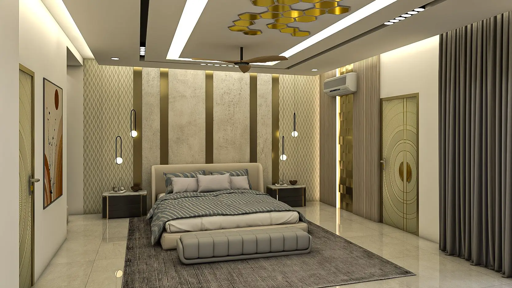
In bedrooms, we tend toward softer, warmer grays that create cocoon-like serenity. These are grays with undertones of taupe or greige, colors that feel embracing rather than stark. We might use pale gray on walls, slightly deeper gray for built-in wardrobes, and medium gray for upholstered furniture, creating a tonal journey that feels restful and complete. In a recent Bangalore master bedroom, we used five different warm grays, from barely-there dove gray on the ceiling to substantial charcoal gray in the custom headboard, creating a space the clients describe as their personal cloud—soft, enveloping, peaceful.
In living spaces where entertaining happens, we often use cooler, more sophisticated grays that create a sense of refinement without formality. These might be grays with subtle blue or green undertones, colors that feel fresh and modern. We balance them with warm elements—teak flooring, brass accents, rich textiles—to ensure the space remains inviting. For a Delhi living room that opens onto a terrace, we used a cool gray with barely perceptible green undertones on walls, allowing the view of garden greenery to feel like an extension of the interior palette.
In kitchens, gray has become almost ubiquitous, but we try to use it with more nuance than the typical gray-cabinets-white-counters formula that’s saturated the market. We might use darker gray for lower cabinets to hide inevitable wear, lighter gray for uppers to maintain brightness, and introduce a third gray tone in open shelving or an island. The key is creating visual interest through tonal variation rather than relying on the standard dark-lower-light-upper formula.
Bathrooms present unique opportunities for gray, particularly in marble and stone applications. Gray marble brings inherent luxury and timeless elegance. We often combine gray marble on floors and shower walls with gray-painted cabinetry and warm brass fixtures, creating a space that feels like a spa retreat. The coolness of gray stone actually becomes an asset in bathrooms, where we associate coolness with cleanliness and refreshment.
Home offices benefit from medium to darker grays that create focus without feeling oppressive. These are spaces where we want to eliminate visual distraction while maintaining energy and alertness. A medium gray on walls provides perfect neutrality for focusing on work, while darker gray in built-in cabinetry creates a sense of permanence and seriousness appropriate to professional work.
The Technical Side: Achieving the Perfect Gray in Different Materials
Creating the perfect gray isn’t simply a matter of selecting a color swatch and applying it. Different materials take gray finishing differently, and understanding these technical requirements is essential for achieving consistent, beautiful results.
In painted finishes, the base color of walls affects how gray appears. Walls previously painted in warm colors may require additional primer coats to prevent warmth from bleeding through and shifting the gray tone. We always test gray paint on actual wall surfaces, painting large test patches that we observe over several days in different lighting conditions. What looks perfect at 2 PM might look entirely wrong at 7 AM or 8 PM. We’ve learned this lesson repeatedly—never select gray paint color based on a small sample or showroom lighting.
In wood finishing, achieving gray requires careful attention to the wood’s inherent color and how finishing products will interact with it. For our Tamil Nadu workshop’s custom furniture, we’ve developed proprietary finishing processes that create gray tones while preserving wood grain. This typically involves a combination of bleaching or lightening treatments, gray stains or dyes that penetrate the wood rather than sitting on top, and protective topcoats that don’t shift color. The process might take two weeks for a single piece, with multiple rounds of application, drying, light sanding, and reapplication.
In stone and tile, gray comes naturally in many materials but varies wildly in undertone. Gray marble might have blue, green, brown, or purple undertones depending on mineral composition. Gray porcelain tile in what appears to be the same color can look completely different from different manufacturers due to variations in composition and firing. We always order large samples and view them in the actual installation location before specifying.
In textiles, gray can shift dramatically based on fiber content and weave structure. Silk in gray has a luminous quality, the fibers catching light and creating subtle shimmer. Linen in gray appears more matte and textured, the irregular weave creating visual interest. Wool in gray feels substantial and warm despite the cool color. We select gray textiles not just for color but for how their material qualities will contribute to the overall feeling of a space.
In metal finishes, gray ranges from bright chrome to aged pewter to blackened steel. Each creates different effects—chrome brings crisp modernity, pewter offers organic warmth, blackened steel provides industrial edge. We use these different metal grays strategically, often combining multiple metal tones in a single space to create layered sophistication.
Gray Through the Seasons: How This Color Changes Year-Round
One of gray’s most fascinating qualities is how it transforms with seasonal light changes, particularly in regions like North India where seasonal variation is dramatic. Understanding these shifts allows you to work with rather than against them.
During the winter months, when northern light is lower and cooler, gray can appear more blue-toned and potentially stark. This is when having warm undertones becomes valuable—a gray with brown or taupe notes will maintain warmth even in cool winter light. In our Delhi projects, we specifically select warm grays for north-facing rooms, knowing they’ll be bathed in cool light for months of the year.
Summer light, higher and warmer, brings out warmth in grays, sometimes to an excessive degree. Grays with cool undertones benefit from summer light, maintaining their sophisticated neutrality rather than appearing yellowish or dingy. South-facing rooms in Indian homes receive intense warm light much of the year, so we often specify cooler grays that won’t be overwhelmed by this warmth.
Monsoon season creates its own lighting challenges—diffused, gray-skied days when natural light itself becomes cool and flat. During these months, warm artificial lighting becomes critical, and grays with warm undertones maintain their appeal while cool grays can appear lifeless. We design lighting systems specifically considering monsoon conditions, ensuring spaces remain inviting even when natural light is minimal.
This seasonal awareness extends to how we specify furnishings and textiles. We might suggest lighter-weight, cooler-toned gray linens for summer months and heavier, warmer gray wools for winter, allowing the space to adapt seasonally while maintaining its fundamental gray palette. This seasonality doesn’t require complete redecorating—simply switching out a few key textile elements allows the space to feel fresh and appropriate year-round.
The Crosby Approach: Gray as Foundation for Sustainable Luxury
At Crosby Project, our commitment to sustainable luxury shapes how we work with gray in distinctive ways. Gray’s timelessness becomes an asset when creating spaces designed to endure for generations rather than follow temporary trends.
We prioritize natural gray materials over artificially colored ones wherever possible. This means specifying stones that are naturally gray rather than dyed, using wood species that can be gray-finished without heavy chemical treatments, selecting textiles colored with low-impact dyes. Our Tamil Nadu workshop has developed relationships with suppliers who can provide sustainably sourced materials in natural gray tones, from stone quarries in Rajasthan to textile mills in Tamil Nadu using natural dyes.
The durability of gray also supports sustainability. Unlike vibrant colors that can tire over years, appropriate grays remain fresh indefinitely. Furniture we crafted twenty years ago in gray tones looks as contemporary today as when first created. This longevity means less need for replacement, less waste, less resource consumption. When clients invest in gray custom furniture from Crosby Project, they’re investing in pieces that will remain relevant through changing design trends.
We also consider gray’s role in creating spaces that age beautifully. Unlike crisp white that shows every mark or deep black that shows every scratch, gray has inherent forgiveness. Subtle variations in tone, minor imperfections, the gentle patina that develops over years—these enhance rather than diminish gray’s appeal. This graceful aging is fundamental to sustainable design, creating environments that improve with time rather than deteriorate.
Our finishing techniques prioritize this aging quality. We don’t seek perfect, sterile gray surfaces that must be maintained in pristine condition. Instead, we create gray finishes that welcome the marks of living, that develop character and depth through use. A gray-finished teak table in our signature style actually improves over years, the grain becoming more prominent, the color gaining subtlety and complexity, the surface telling the story of meals shared and conversations held.
Beyond Neutral: Gray as Expression
The final misconception we work to overcome is viewing gray merely as background, as neutral filler in service of other colors. In truly sophisticated interiors, gray becomes expressive, creating mood and atmosphere as powerfully as any color.
Consider the difference between a warm, taupe-gray living room and a cool, blue-gray one. Both are gray, both are neutral by definition, yet they create entirely different emotional experiences. The warm gray feels embracing, comfortable, familiar—perfect for a family gathering space. The cool gray feels refined, contemplative, calm—ideal for a formal sitting room or art gallery setting.
This expressive quality of gray allows us to create entire homes in primarily gray palettes that never feel monotonous or boring. A recent project in Bangalore executed almost entirely in grays demonstrates this—entry hall in cool pale gray, living room in warm medium gray, dining room in formal deep gray, bedrooms in soft dove gray, study in rich charcoal gray. Each space has its own character and mood, yet the home flows seamlessly, united by the common thread of gray rendered in infinite variation.
The clients initially worried this much gray would feel cold or institutional. The reality couldn’t be more different. Visitors consistently comment on the warmth and livability of the spaces, never registering that they’re surrounded by what is technically a monochromatic gray palette. The variety in texture, the attention to lighting, the strategic inclusion of warm wood tones and brass accents—these create warmth and interest that transcends the color palette itself.
This is perhaps the ultimate lesson we’ve learned about gray after two decades of intensive work with this remarkable color: it’s not about the gray itself, but about everything you bring to it. Gray becomes what you make it—warm or cool, formal or casual, modern or traditional, quiet or dramatic. Its neutrality is not weakness but strength, not absence but possibility.
For those willing to engage with gray’s complexity, to understand its nuances and master its application, it offers design opportunities unavailable with any other color. It creates spaces that transcend trend, that remain fresh through changing fashions, that provide sophisticated backdrops for life’s unfolding dramas.
This is why gray has become central to Crosby Project’s design philosophy. Not because it’s fashionable—though it certainly is. Not because it’s easy—it emphatically isn’t. But because it offers the perfect medium for creating the timeless, sophisticated, sustainable luxury that defines our work.
In gray, we find infinite possibility. And in the hands of artisans who understand its nature, gray becomes not just a color but a language—one that speaks of refinement, of thoughtfulness, of spaces designed with care and intended to endure.
For consultations on incorporating sophisticated gray palettes into your home, contact Crosby Project:
Tamil Nadu Workshop & Showroom
355/357, Bhavani Main Road, Sunnambu Odai, B.P.Agraharam, Erode, Tamil Nadu 638005, India
International Office – Dubai
Platinum Tower, Jumeirah Lake Towers, Star Business Centre DMCC, Unit Number 808-04
Ireland Office
16 Leopardstown Abbey, Carrikmines, Dublin 18 D18YW10, Ireland
Contact: +91-8826860000 | +91-8056755133 | care@crosby.co.in