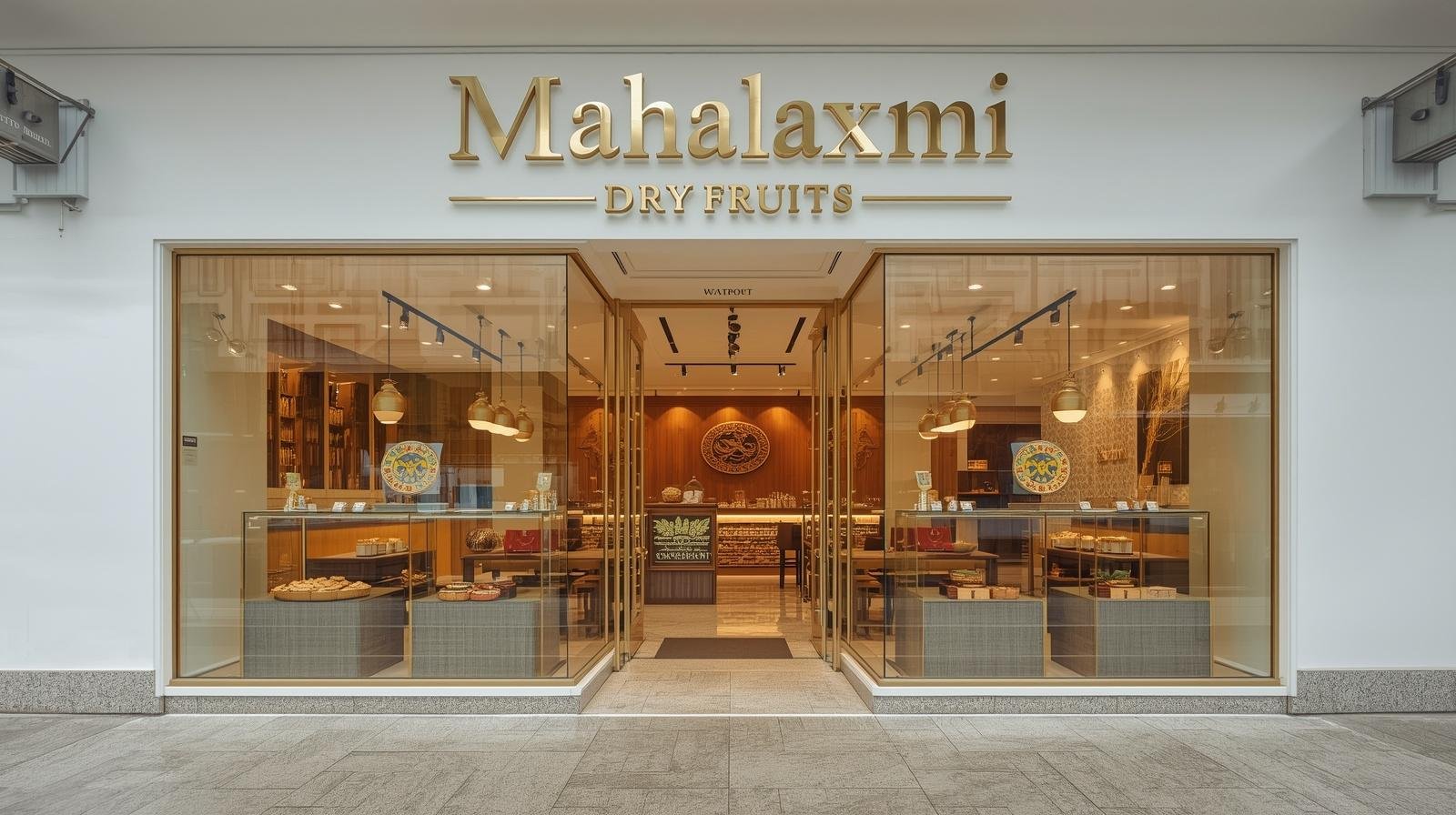
Modern Efficiency in Traditional Trade The Mahalaxmi family had operated a dry fruit wholesale business in Thane for two decades, supplying restaurants and sweet shops throughout Mumbai. Their decision to open a retail storefront represented significant business evolution—shifting from B2B bulk sales to consumer-facing retail requiring completely different spatial and visual strategies.
The brief emphasized contemporary efficiency over traditional dry fruit shops' typical aesthetic: wooden crates stacked high, products in open bins, dim lighting concealing dust, and cluttered displays overwhelming rather than inviting customers. The family wanted to compete with modern organized retail's visual standards while maintaining the authentic product quality and pricing that differentiated them from supermarket chains.
The 1,600-square-foot space occupied a corner ground-floor unit in Thane's commercial area with good foot traffic from residential neighborhoods. Large windows on two sides provided street visibility—valuable real estate for retail—but also exposed the interior to dust and sun requiring careful material and product protection strategies. The timeline was aggressive: three months from lease signing to grand opening. The family couldn't afford extended closure between wholesale operations and retail launch, requiring swift design development, procurement, fabrication, and installation.
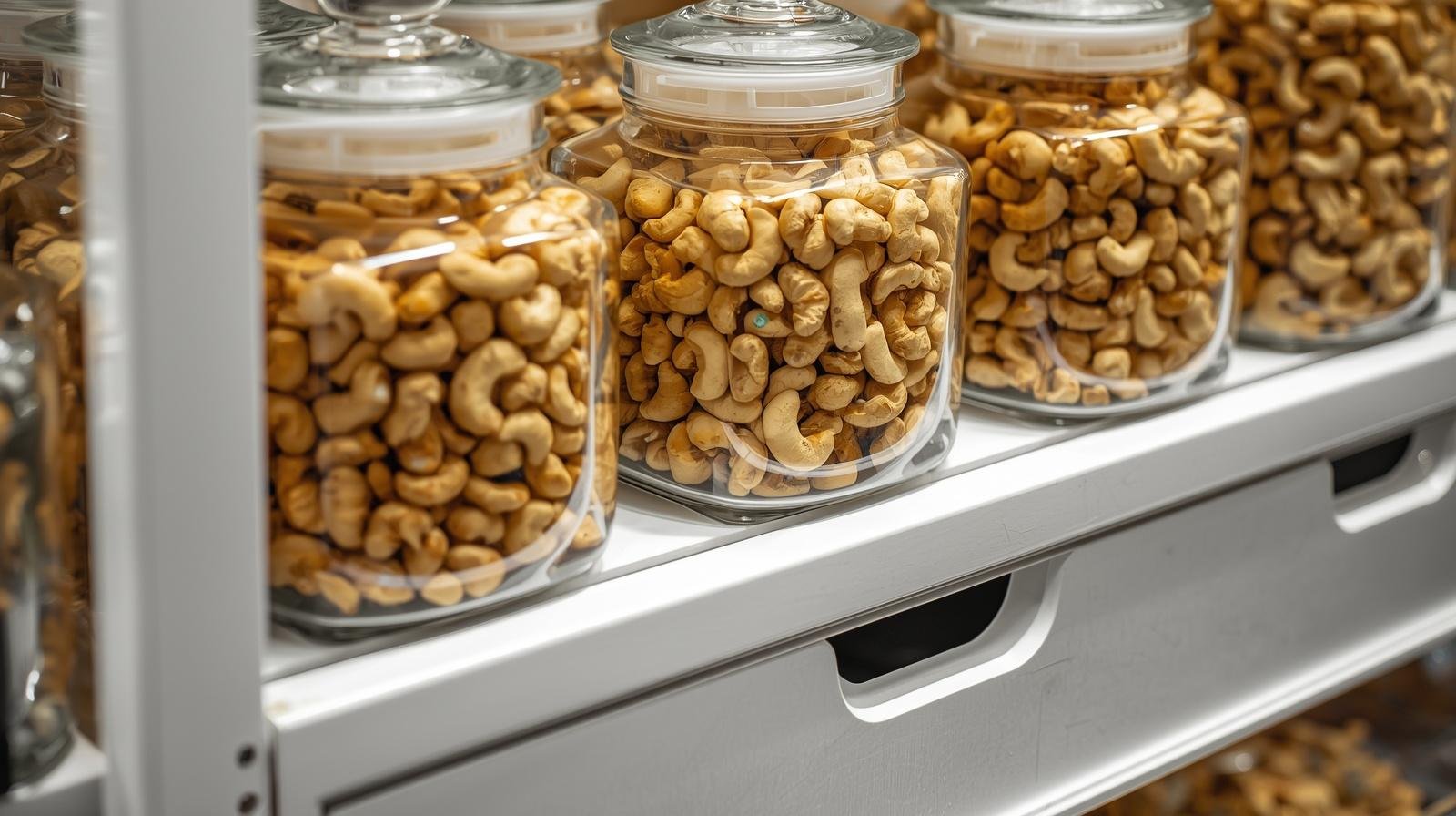
The Challenge: Hygiene Meets Visibility Dry fruit retail presents unique design challenges. Products must be visible for selection but protected from contamination, dust, and moisture. Traditional open bins allow customers to see and sometimes touch products but create hygiene concerns increasingly important to urban consumers. Sealed containers protect products but hide them, requiring customers to rely on labels rather than visual assessment.
The temperature and humidity control becomes critical—cashews, almonds, and dried fruits deteriorate rapidly in Mumbai's humid climate without proper storage. Yet the storage solutions can't create sterile clinical environment that contradicts the warmth and authenticity dry fruit shopping evokes. We needed to balance transparency (allowing product visibility), hygiene (protecting products appropriately), efficiency (allowing staff to restock quickly and serve customers smoothly), and warmth (maintaining the inviting character that brings customers to specialty stores rather than supermarkets).
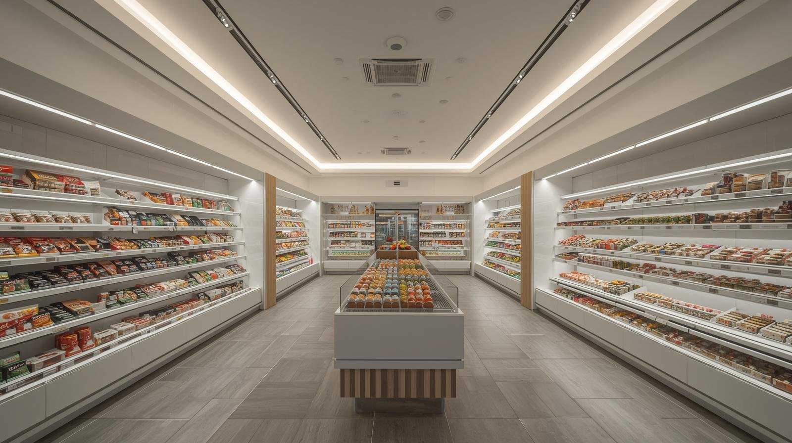
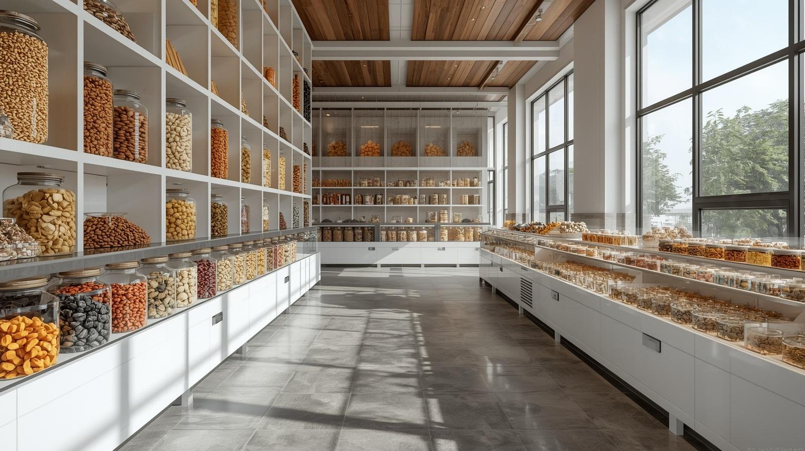
Spatial Strategy: Customer Journey Design The 1,600 square feet divided into clear zones: entry and browsing (300 sq ft), checkout counter and packaging area (100 sq ft), storage and prep room (200 sq ft). This organization creates natural customer flow from entry through browsing to purchase without backtracking or congestion.
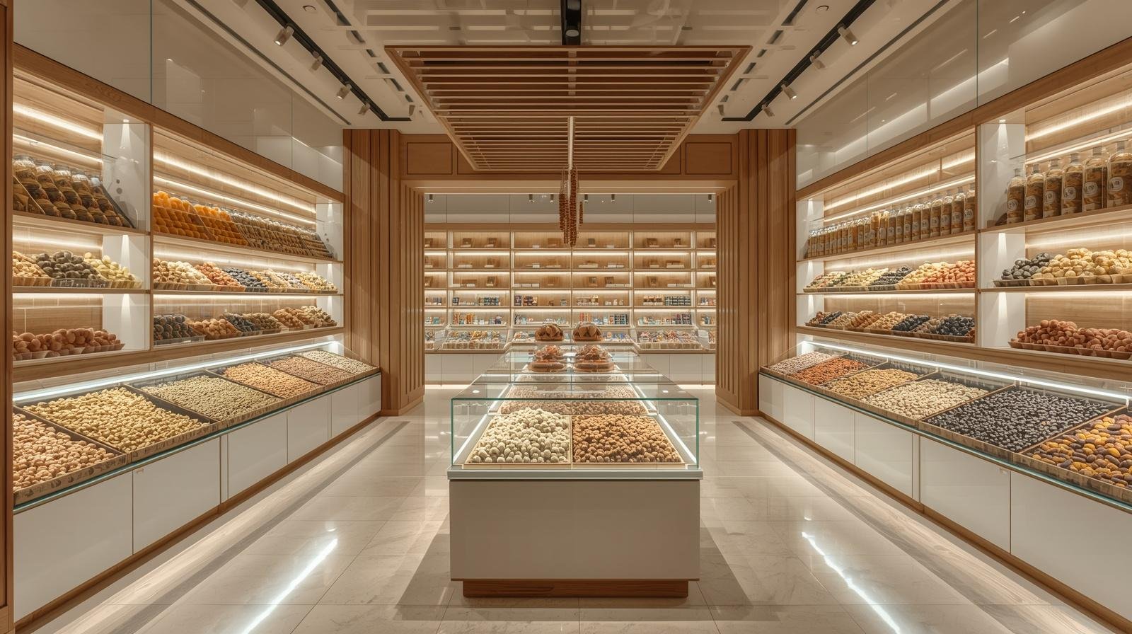
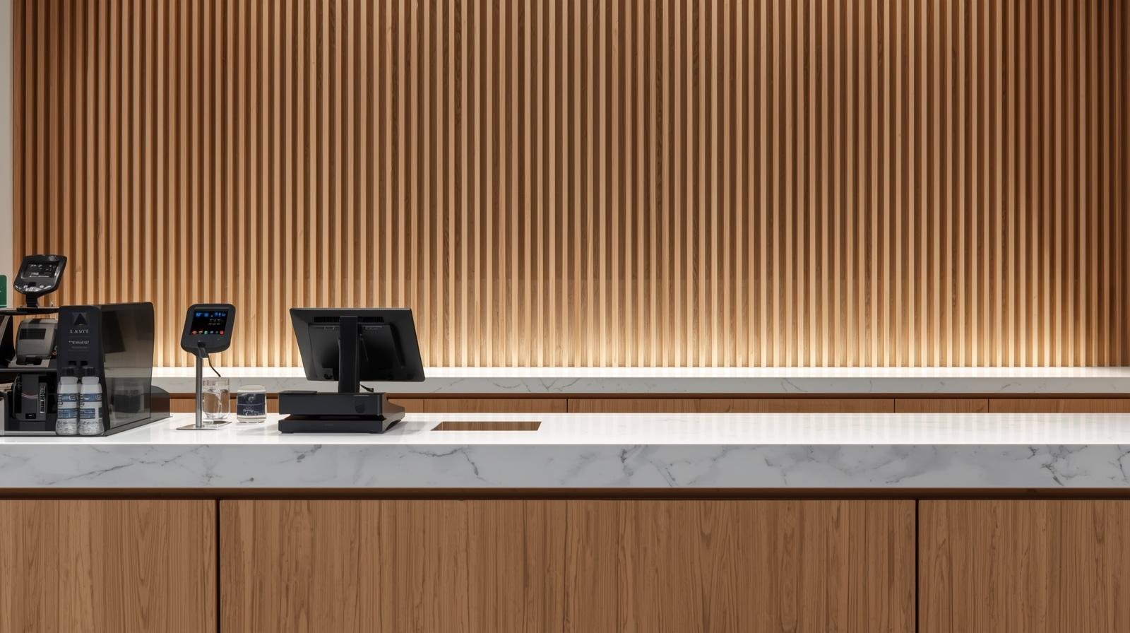
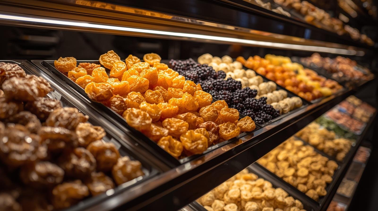
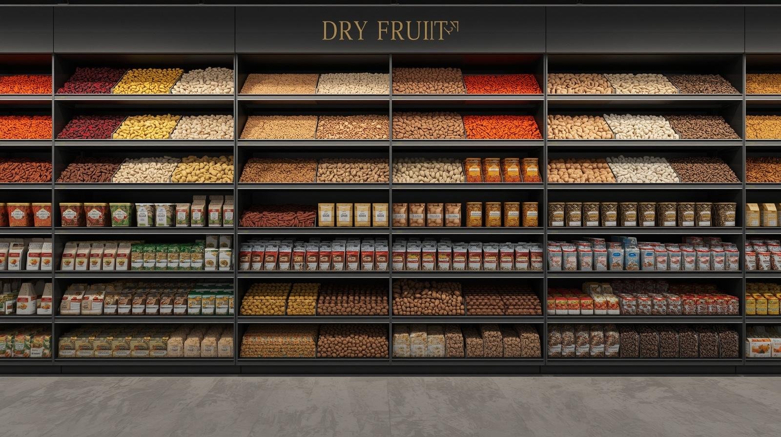
The steel framework powder-coating is pure white creating clean contemporary backdrop allowing products' natural colors—golden cashews, dark raisins, green pistachios—to provide visual interest. The white also signals cleanliness and hygiene—subliminal but important messaging for food retail. Product labeling employs simple printed cards in wooden holders: product name, origin, grade (when applicable), price per kilogram. The cards are replaceable allowing easy price updates without permanent signage requiring professional replacement.
Materials: Clean Contemporary The material palette emphasizes cleanliness through light tones and smooth surfaces while adding warmth through natural wood accents: Display Frameworks: Powder-coated steel in matte white, easy to wipe clean, doesn't show dust accumulation like dark colors. Counter: White quartz surface (seamless, non-porous, stain-resistant) with oak veneer base adding warmth. Flooring: Large-format grey porcelain tiles (600x600mm) with subtle texture, minimal grout lines, easy to clean and maintain.
Lighting: Product Highlighting Lighting serves critical functions: making products visible for selection, creating inviting atmosphere encouraging browsing, and maintaining hygiene through adequate illumination showing cleanliness.
Checkout Counter: Operational Hub The checkout counter serves multiple functions: payment processing, product weighing and packaging, customer interaction, and visual termination of the space. At 8 feet long, the counter accommodates two staff members working simultaneously during peak periods. The counter employs white quartz top (seamless, stain-resistant, easy to sanitize) at standard height (36 inches). Below, oak veneer cabinetry provides storage for packaging materials (paper bags, boxes, plastic containers), receipt rolls, and daily operational items.
Storage & Prep Room: Functional Backbone The 200-square-foot back room handles receiving, storage, prep, and staff functions. While invisible to customers, this space's efficiency directly impacts front-of-house operations.
More significantly, the contemporary design positions Mahalaxmi for expansion. The modular display system can replicate in additional locations, and the branding provides foundation for multiple outlets unlike traditional shops whose identity exists only in founder's personal reputation.
"Crosby transformed our business vision into reality. The contemporary design attracted customers we never reached before—young professionals who want quality but expect modern shopping experiences. Our revenues exceeded projections by 30% in first six months. Customers consistently praise the cleanliness and organization, and the efficient layout made staff training much easier. The investment paid for itself faster than expected, and we're now planning a second location using the same design approach. We couldn't be more satisfied."— Prakash Mahalaxmi, Owner, Mahalaxmi Dry Fruit Store
Specification: 2mm thickness, light grey, commercial wear rating
Durable vinyl tile flooring throughout classrooms and common areas withstands heavy student traffic. Light grey color conceals dirt better than white while remaining brighter than dark alternatives. Commercial wear rating ensures years of use without replacement. Easy maintenance (regular mopping) suits school cleaning protocols.
Specification: Magnetic surface, aluminum frame, full-wall mounting
High-quality whiteboards in every classroom provide ghost-free writing surface even after years of use. Porcelain-on-steel construction (not cheaper melamine alternatives) ensures longevity. Magnetic surface allows attaching teaching aids. Aluminum frames in silver finish provide clean contemporary detail. Full-wall mounting maximizes usable surface area essential for teaching.
Specification: Pure white quartz composite, 20mm thickness, seamless installation
The checkout counter employs engineered quartz in pure white providing seamless non-porous surface essential for food retail. The material resists staining from oils and moisture common when handling nuts and dried fruits. The 20mm thickness provides substantial appearance while being standard dimensionally. Seamless installation (8-foot single piece) eliminates joints where contamination could accumulate.
Specification: Engineered oak veneer, vertical slat pattern, clear finish
The oak accents (counter cabinetry and vertical slat wall) provide natural warmth balancing the predominantly white interior. We specified engineered oak veneer in uniform grain pattern creating consistency across all oak elements. The slat wall employs 40mm wide vertical strips with 20mm spacing creating rhythm and texture while concealing storage room door behind. Each slat mounts to hidden framework with LED strip backlighting between slats creating subtle glow. Clear polyurethane finish protects wood while allowing natural color and grain to show.
Specification: 600x600mm rectified porcelain, matte finish with subtle texture
Flooring employs contemporary large-format tiles in medium grey creating neutral backdrop while being highly practical for food retail. The 600x600mm size with rectified edges allows minimal 2mm grout lines creating cleaner appearance than smaller traditional formats. Matte finish with subtle texture provides slip resistance essential for safety (food retail often has spills) while concealing dirt and wear better than glossy alternatives.
Specification: 3000K warm white, CRI >90, IP54 rated for food retail
Product accent lighting employs LED strips integrated within each display shelf creating warm glow on products. The 3000K color temperature (warm white) creates inviting atmosphere while accurately rendering product colors—critical for customers visually assessing quality. High Color Rendering Index (CRI >90) ensures colors appear natural rather than distorted. IP54 rating (dust and splash protection) provides appropriate durability for food retail environment where cleaning is frequent. Low voltage operation (24V) provides safety while consuming minimal energy (5W per meter).
Design Lessons: Retail Modernization The project demonstrates principles applicable to traditional retail categories seeking contemporary market relevance: Transparency builds trust: Visible products in clean displays communicate quality more effectively than hidden storage requiring trust without verification. For Crosby, Mahalaxmi represents our capacity to modernize traditional business categories through thoughtful design serving both customer experience and business operations. Not every project requires luxury budgets; sometimes the most satisfying work involves helping small businesses compete effectively through intelligent design investment.
We collaborate with globally mobile clients creating value in compact urban environments. We execute Interior Design, Technology Integration, Furnishing & Styling which result in incresed revenue. Our approach synthesizes cultural influences through material craft and spatial precision.
Begin Conversation